
Choosing shutter colours sounds simple until you stand in front of a painted wall and feel unsure. Many UK homeowners worry about getting it wrong and living with a choice that feels off every day. This guide explains, in plain terms, how to match shutters with wall colours so your home feels balanced, calm, and well thought out.
To match shutters with wall colours, focus on light, undertone, and contrast. Neutral shutters suit most walls. Bold walls need calmer shutters. Soft walls allow more freedom. Test samples before deciding.
Now let’s break this down properly.
Shutters are not like cushions or throws. You don’t change them often. Once fitted, they become part of the room’s structure. That means the colour choice affects how the space feels every day, in every season.
In real homes, I’ve seen beautiful rooms feel cold or heavy simply because the shutter colour fought against the wall colour. I’ve also seen small rooms feel larger just by choosing the right contrast.
This is not about trends. It’s about balance.
Many beginners make the mistake of choosing shutter colours first. That often leads to frustration later.
Walls cover more visual space than shutters. They set the mood of the room. Shutters should support that mood, not compete with it.
Before choosing, ask yourself:
Once you know this, shutter colours become easier.
Light walls are common in UK homes for good reason. They reflect light well and suit many styles.
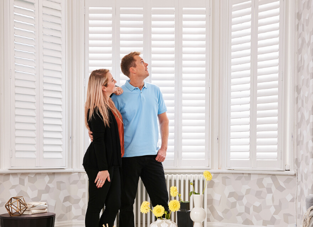
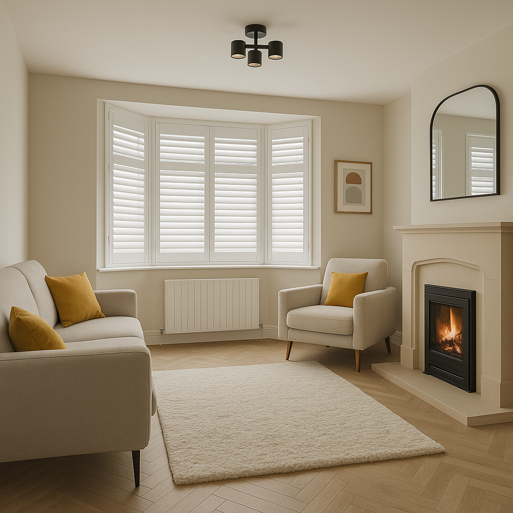
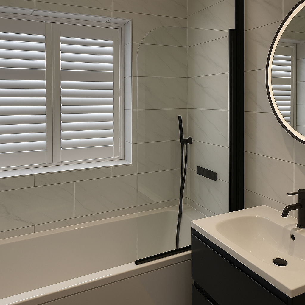
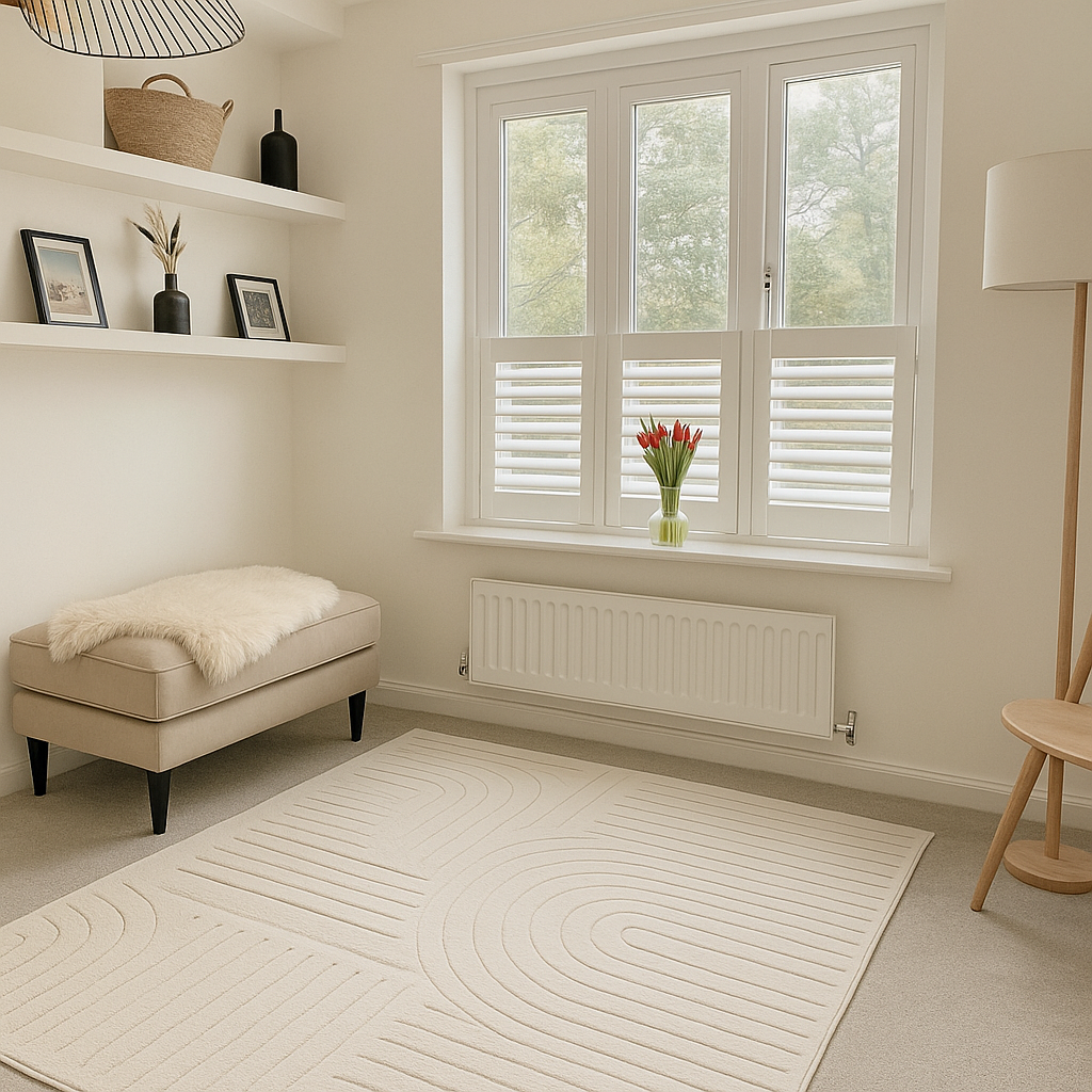
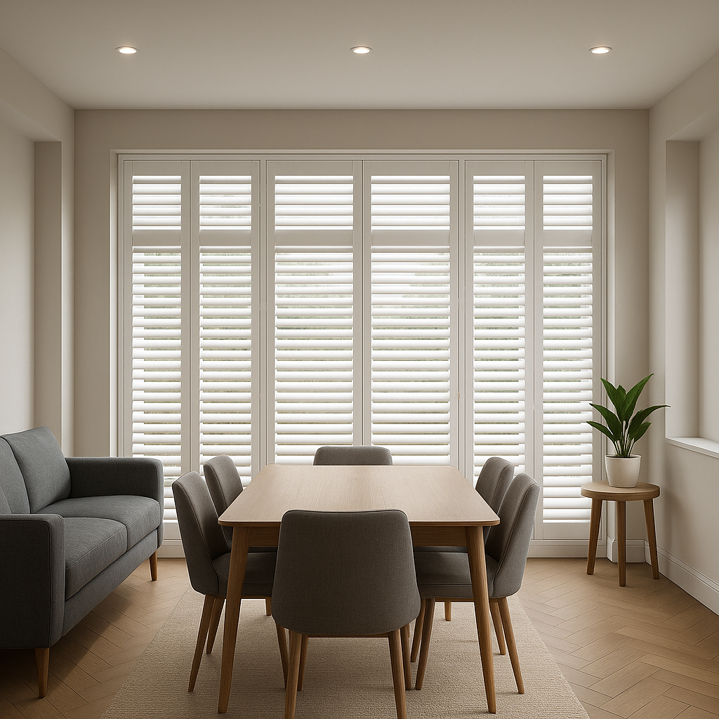
If your walls are white, cream, soft grey, or pale beige, you have flexibility. These wall colours work well with both matching and contrasting shutters.
Good options usually include:
In modern homes, matching white shutters with white walls creates a calm, built-in feel. In older homes, a softer white often looks more natural.
Bold wall colours are popular, but they require more care.
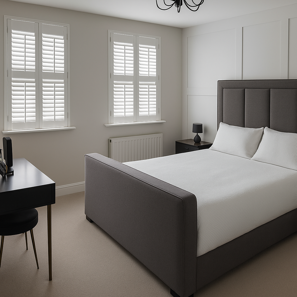
When walls are navy, forest green, charcoal, or deep blue, the shutters should calm the space. In most cases, dark shutters make rooms feel smaller and heavier.
A safer approach is:
In homes I’ve worked with, soft white or pale grey shutters almost always work better with bold walls than matching dark tones.
Two colours can look similar but still clash, which is a common issue highlighted in any DIY Shutter Guide. This usually happens because of undertones.
Undertones are the subtle warm or cool notes beneath a colour. If these fight each other, the room feels uncomfortable even if you can’t explain why.
Here’s a simple guide:
If your wall paint looks slightly yellow or creamy, avoid blue-based whites. If it looks crisp or icy, avoid creamy shutters.
Light changes colour more than people expect.
A shutter colour that looks perfect online can feel wrong at home because light direction matters.
North-facing rooms get cooler light. South-facing rooms get warmer light. East and west rooms change throughout the day.
This is why testing samples is not optional. It’s practical.
Before deciding:
This step alone prevents most regret.
Not every room needs the same shutter colour. Homes feel more natural when choices suit how each space is used.
These benefit from calm, neutral shutter colours that don’t distract. Soft whites and light greys usually work best.
Bedrooms feel better with gentle contrast. Avoid stark whites if walls are warm. Comfort matters here more than impact.
Practicality matters. Light shutter colours keep these rooms fresh and bright, especially in smaller spaces.
Privacy matters here. Café-style shutters in neutral colours work well without blocking light.
These mistakes show up often, even in well-designed homes.
Avoiding these saves time, money, and frustration.
This is one of the most common questions.
Exact matching can work, but only when done carefully. In many cases, a slight contrast looks better and more intentional.
Matching works best when:
Contrast works better when:
There is no single right answer. The room decides.
White shutters are still the most chosen option, and not because people lack imagination.
They work because they:
The key is choosing the right white. Bright white, soft white, and warm white all feel different in real homes.
In 2026, UK homeowners prefer safe, lasting choices over fast trends. Soft neutrals, muted tones, and natural finishes are growing.
That doesn’t mean it’s boring. It means thoughtful.
Expect to see more:
These choices last longer and feel calmer over time.
Confidence comes from preparation, not guessing.
Before ordering shutters:
When these steps are followed, regret is rare.
Matching shutter colours with wall colours does not need to be stressful. When you focus on balance, light, and undertone, good choices become clear.
Shutters should support your home, not shout for attention. The best combinations feel natural, calm, and easy to live with.
If you’re unsure, start neutral, test samples, and trust how the room feels, not just how it looks online. That approach works today and will still work years from now.
If you want help visualising options, testing finishes, or understanding what suits your home, gentle guidance can make the process much easier.
Light walls, like whites, creams, or pale greys, work well with neutral or slightly contrasting shutters. Soft whites or light greys create a clean, balanced look, while subtle contrasts can add depth.
For deep blues, greens, or charcoals, choose lighter shutters to prevent the room from feeling heavy. Neutral shades like off-white or soft grey help balance bold walls.
Not always. Matching works for a clean, built-in feel on neutral walls. Slight contrast is often better for bold walls or to highlight windows naturally.
Undertones (warm or cool hints in colours) are crucial. Warm walls pair best with warm shutters, cool walls with cool shutters, and neutral shutters work when undertones are unclear.
Always use samples at home. Check them in natural light throughout the day and under artificial light. Hold them next to the wall and observe how they feel in the room.
Yes, but consider each room individually. Neutral colours work almost everywhere, while some rooms (like kitchens or bedrooms) might benefit from gentle contrast for comfort and style.
Checkout safely with Stripe — encrypted, secure, and trusted worldwide. Pay with Visa, MasterCard, Amex, or PayPal.
info@shutters365.co.uk
Unit 82a
James Carter Road,
Bury St. Edmunds,
IP28 7DE
Our registered office is listed above. Please note this is not a showroom or returns address.
© Shutters365 Ltd ®.(Registered in England and Wales Co. No.16654353).