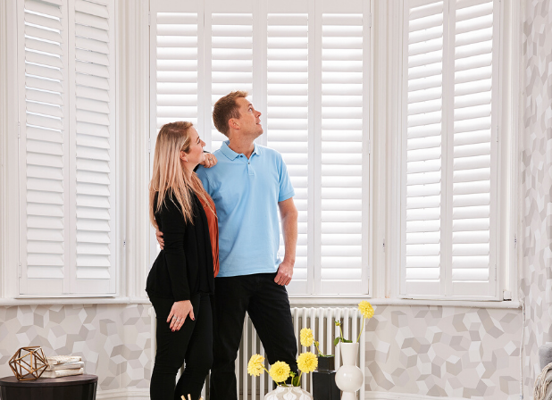

Whether you’re giving your home a fresh look or choosing shutters for the first time, one question always comes up: should the shutters be darker or lighter than the walls? It sounds like a simple choice, but the right answer depends on your room size, the amount of natural light, your existing décor, and even the UK climate.
This guide covers everything from the basic rules most people follow, to the sneaky mistakes even experienced decorators make, to room-by-room advice you won’t easily find anywhere else. By the end, you’ll know exactly what colour shutters to pick for every single room in your home.
Shutters are not just a window covering, they’re a permanent design feature. Unlike curtains or blinds that you can swap out on a budget, shutters tend to stay put for years, sometimes decades. The colour you choose will:
Getting the colour right from the start saves you time, money, and the regret of staring at the wrong shade every single morning.
Here’s the honest answer: it depends on what effect you want.
But that’s not very helpful on its own, so let’s break it down clearly.
Choose LIGHTER shutters when you want to:
Choose DARKER shutters when you want to:
The general rule of thumb used by most interior designers is this:
Light walls + darker shutters = contrast and definition. Dark walls + lighter shutters = balance and breathing room.
However, there’s much more nuance than this, and that’s what the rest of this guide will explain.
This is probably the single biggest factor most people overlook. Colour has a direct psychological effect on how spacious a room feels.
How much daylight does the room get? This is crucial and often overlooked in online guides.
North-facing rooms in the UK get very little direct sunlight. The light is cool, slightly blue, and flat. In these rooms:
South-facing rooms get the most sunlight throughout the day. In these rooms:
East-facing rooms get lovely morning light but are darker in the afternoon. Light or mid-tone shutters work best to make the most of the morning sun.
West-facing rooms get warm afternoon and evening light. This warm golden tone makes earthy, mid-tone shutters (like oak, warm grey, or sage green) look especially beautiful.
Pro tip from decorators: Before deciding on a shutter colour, spend a whole day observing how light moves through the room. Take photos at 8 am, 12 pm, and 4 pm. What looks bright at noon can look dull and shadowy by mid-afternoon.
Your shutters need to work with what’s already in the room or what you’re planning to put in it.
Each room in your home has a function, and the colour should support that function.
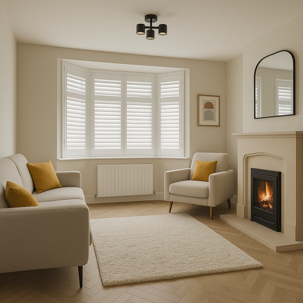
The living room is where you relax, entertain, and spend the most time. You want it to feel welcoming but also have personality.
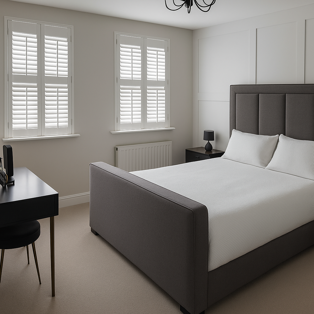
Sleep quality is affected by light and mood. Bedrooms generally benefit from a calm, restful atmosphere.
Kitchens are busy, active spaces. They tend to need practical, easy-to-clean shutters.
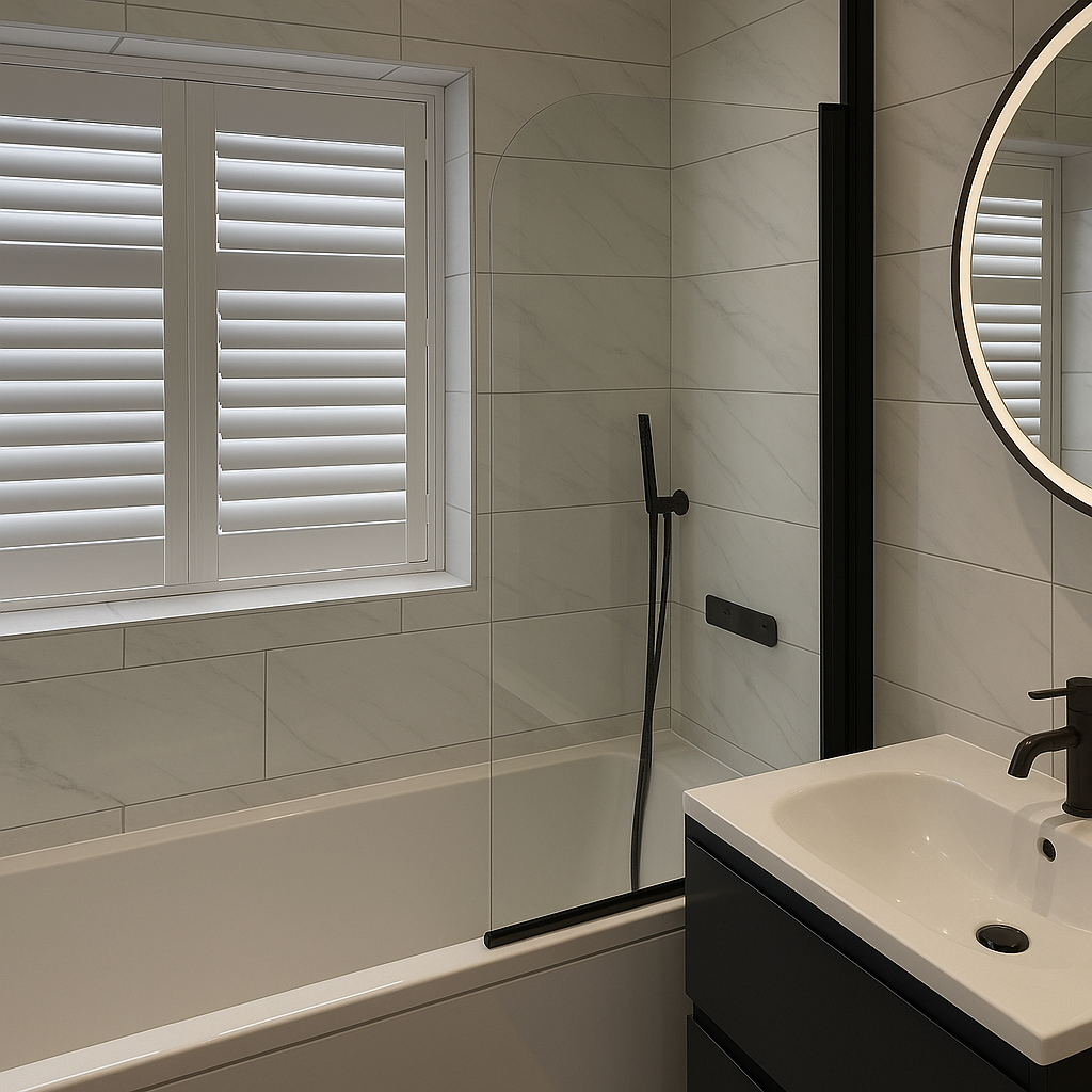
Bathrooms in the UK are often small and can feel cold.
You need focus and energy, but not so much stimulation that you can’t concentrate.
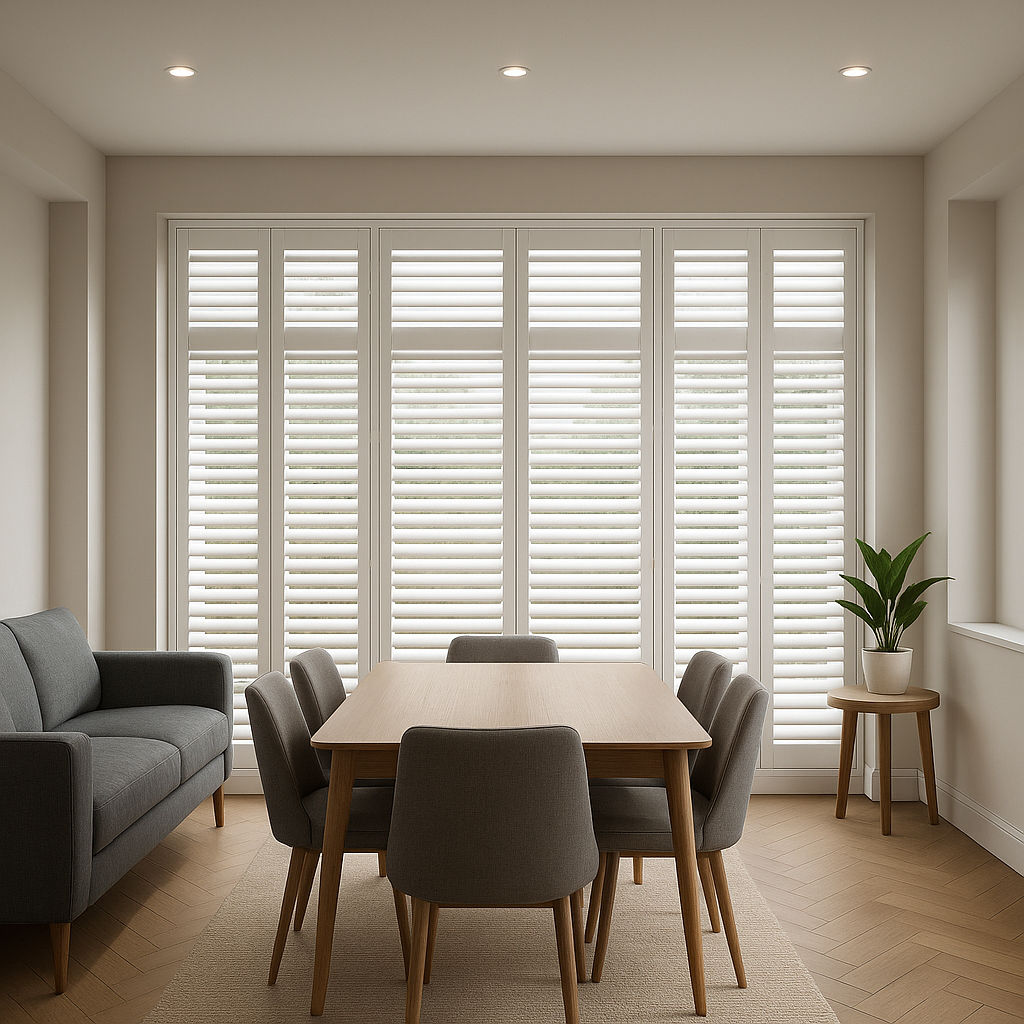
The dining room is a space for entertaining and making an impression.
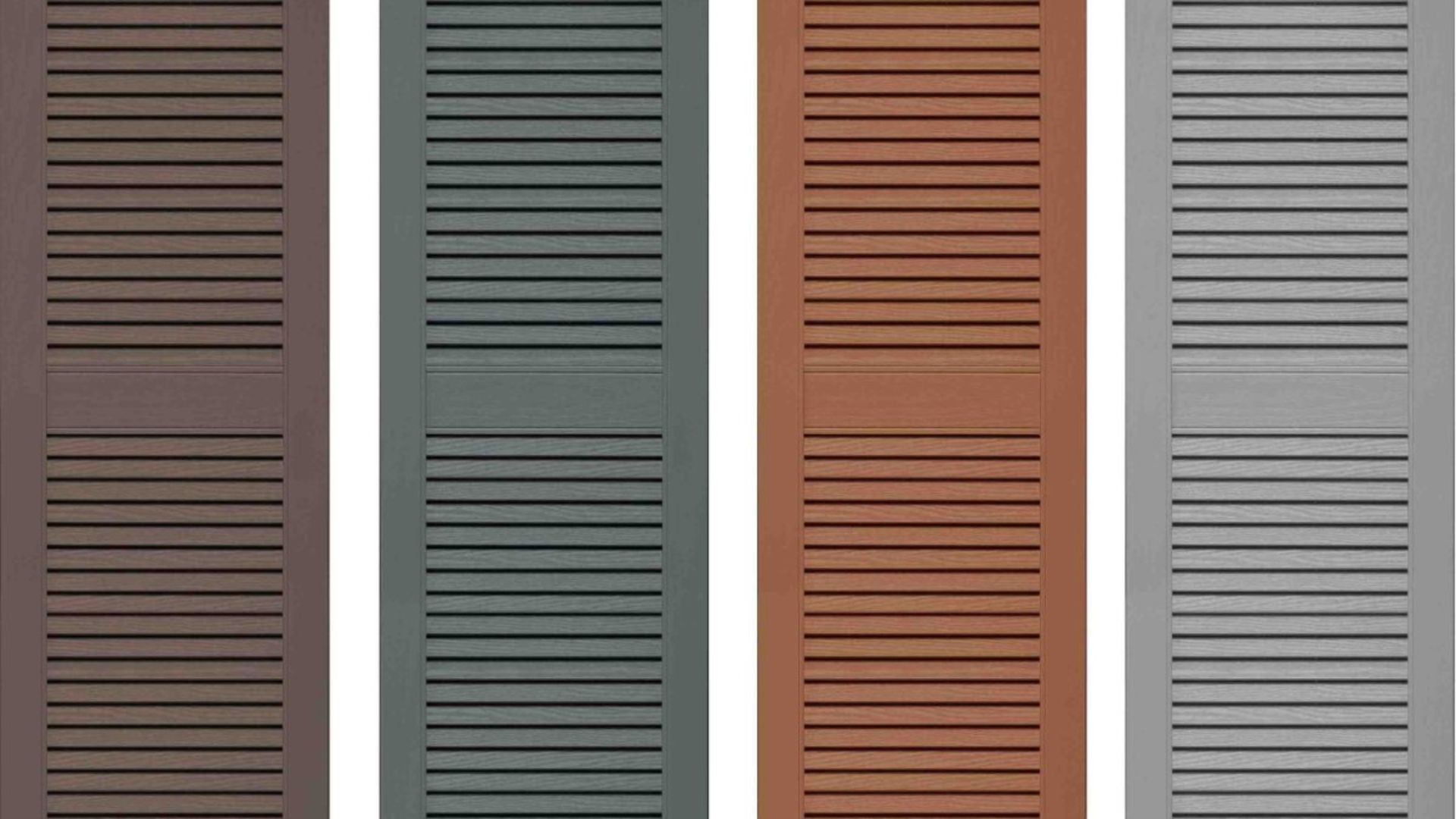
Different shutter styles suit different colour approaches.
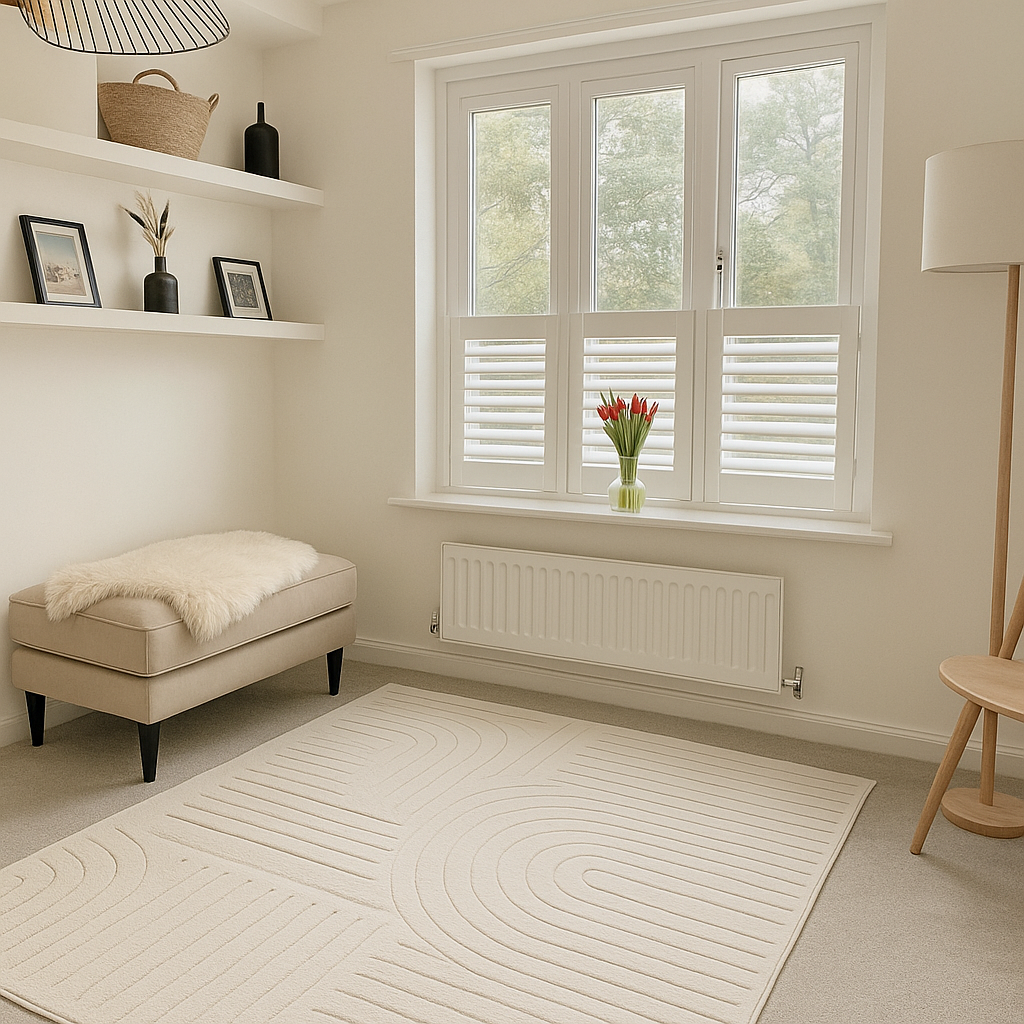
The UK’s most popular shutter colour by far. Works in virtually every room and every home style. Best for: small rooms, north-facing rooms, bathrooms, kitchens, and anyone who wants a clean, timeless, low-risk look.
Slightly warmer than pure white, which makes it feel cosier and less clinical. Best for: bedrooms, living rooms with warm-toned décor, and traditional-style homes.
A modern, versatile neutral that feels fresh and contemporary without being cold. Best for: modern kitchens, home offices, and neutral interiors.
A sophisticated, striking choice that works beautifully as a contrast colour. Best for: large, well-lit rooms, dining rooms, modern interiors, and rooms with white or very pale walls.
Warm, natural, and timeless. Works across traditional, Scandi, and modern farmhouse styles. Best for: living rooms, bedrooms, and kitchens with wood or warm-toned décor.
Rich and elegant. Works best in formal spaces with good natural light. Best for: dining rooms, master bedrooms, and traditional-style studies.
A bold but surprisingly versatile choice. Works especially well in UK homes where the exterior features brick. Best for: living rooms, dining rooms, and any room where you want personality without going too eccentric.
An increasingly popular choice in UK homes. Soft, earthy, and calming. Best for: kitchens, bedrooms, and rooms with natural materials like stone, rattan, or linen.
Room | Best Shutter Tone | Top Colour Picks |
|---|---|---|
| Small bedroom | Light | White, warm cream, light oak |
| Large master bedroom | Light to mid | Cream, warm grey, natural wood |
| Small bathroom | Light | White, soft grey |
| Living room (north-facing) | Light to mid | Cream, warm white, dove grey |
| Living room (south-facing) | Any | Charcoal, navy, white |
| Modern kitchen | Light to mid | White, light grey, sage green |
| Farmhouse kitchen | Mid | Cream, natural oak, sage green |
| Dining room | Mid to dark | Charcoal, navy, dark espresso |
| Home office | Light to mid | White, light grey, natural wood |
| Hallway | Light | White, cream (avoid dark in narrow hallways) |
If you’re based in the UK and want to fit shutters yourself, quality and accuracy of measurement are everything. A poor-quality shutter will warp, discolour, or fail to close properly, and no amount of great colour choice will save a badly made product.
One of the best options for DIY shutters in the UK is Shutters365. They offer:
Whether you’re choosing classic white plantation shutters for a bedroom or dark wood café shutters for a kitchen, Shutters365 gives you the tools to get a professional result on a DIY budget. Their colour range makes it easy to match the advice in this guide to a real product you can order and install yourself.
Before committing to any shutter colour, follow these steps:
Step 1: Get samples. Always request colour samples or swatches before ordering. Any reputable shutter company will provide these.
Step 2: Place samples against your walls: Hold the sample against your wall, your floor, and your window frame. See how they relate to each other.
Step 3, Observe at different times of day: Morning, noon, and evening light all look different. A colour that works at 110 ammight look completely wrong at 4 pm on a dull November afternoon.
Step 4, Test on a cloudy day: Given the British weather, always make sure you like the colour when it’s grey and overcast outside, not just on the rare sunny day.
Step 5, Step back: Hold the sample at the window and step back to the opposite side of the room. That’s the distance from which you’ll see the shutters most of the time. How does it look from there?
Step 6 Photograph it: Take a photo with your phone and compare it to photos of your furniture and the room as a whole. Sometimes the camera captures colour differences more objectively than the eye.
Trends come and go. What’s fashionable in 2025 might feel dated by 2030. When in doubt, lean towards colours that work with your specific room, its size, its light, and its purpose rather than what’s trending on Instagram or Pinterest.
Lighter shutters are almost always a safe bet and work in most UK homes. Darker shutters are a rewarding choice when used with confidence in the right space. And if you’re ever genuinely unsure, neutral mid-tones like warm grey, natural oak, or soft cream split the difference beautifully.
Take your time, get samples, and view them in your actual home before you decide. Shutters are a long-term investment, and the right colour will make you happy every time you walk into the room.
Looking for quality-made-to-measure DIY shutters in the UK? Visit Shutters365 and custom design your shutters to explore colours, styles, and options for every room in your home.
Checkout safely with Stripe — encrypted, secure, and trusted worldwide. Pay with Visa, MasterCard, Amex, or PayPal.
info@shutters365.co.uk
Unit 82a
James Carter Road,
Bury St. Edmunds,
IP28 7DE
Our registered office is listed above. Please note this is not a showroom or returns address.
© Shutters365 Ltd ®.(Registered in England and Wales Co. No.16654353).